Thoughts, updates and experiments.
-
Questions about dyslexia
Starting from big to small, here are some questions I have about dyslexia fonts and the research that tests them and supports them.1
If it is true that ‘we read best what we read most’, what do we read most? In which medium do we read that the most? How do people feel about the fonts they read the most? Is familiarity with a bad font better overall than offering up a new distinctive, dyslexia-focused design?
The distinction between graphemes and phonemes is considered one of the main exhibitions of dyslexia.2 How much is the Latin alphabet suited to attempt to bridge this gap? Or would every grapheme–phoneme-combination be, in essence, language-constrained, or even limited to dialects? And then, does it logically follow that the International Phonetic Alphabet might be a better fit (if not practically or realistically)? If dyslexia functions differently according to the language involved, how does a specific font approach this problem?3 Essentially, is this a font problem or a language problem?
Another chief dyslexic problem is the confusion between similar shapes, such as the bdpq set. Can that be fixed by modifying the descenders or by modifying the bowls? How about both? Which changes benefit readability for everyone?
Translation-style pen-based type design inherently has ‘systematically different’ contrast angles – could that already prevent confusion between b and d?
Is a good dyslexic typeface perhaps simply a distinctive typeface with high information density? Is that not just a particular style of typeface?
-
Of particular note is the research that purported to scientifically test the Dyslexie font, written by Renske de Leeuw. ↩
-
Functional neuroanatomy of developmental dyslexia: the role of orthographic depth – A dozen sources support the notion that a shallow orthography is easier to tackle than a deep orthography. ↩
-
-
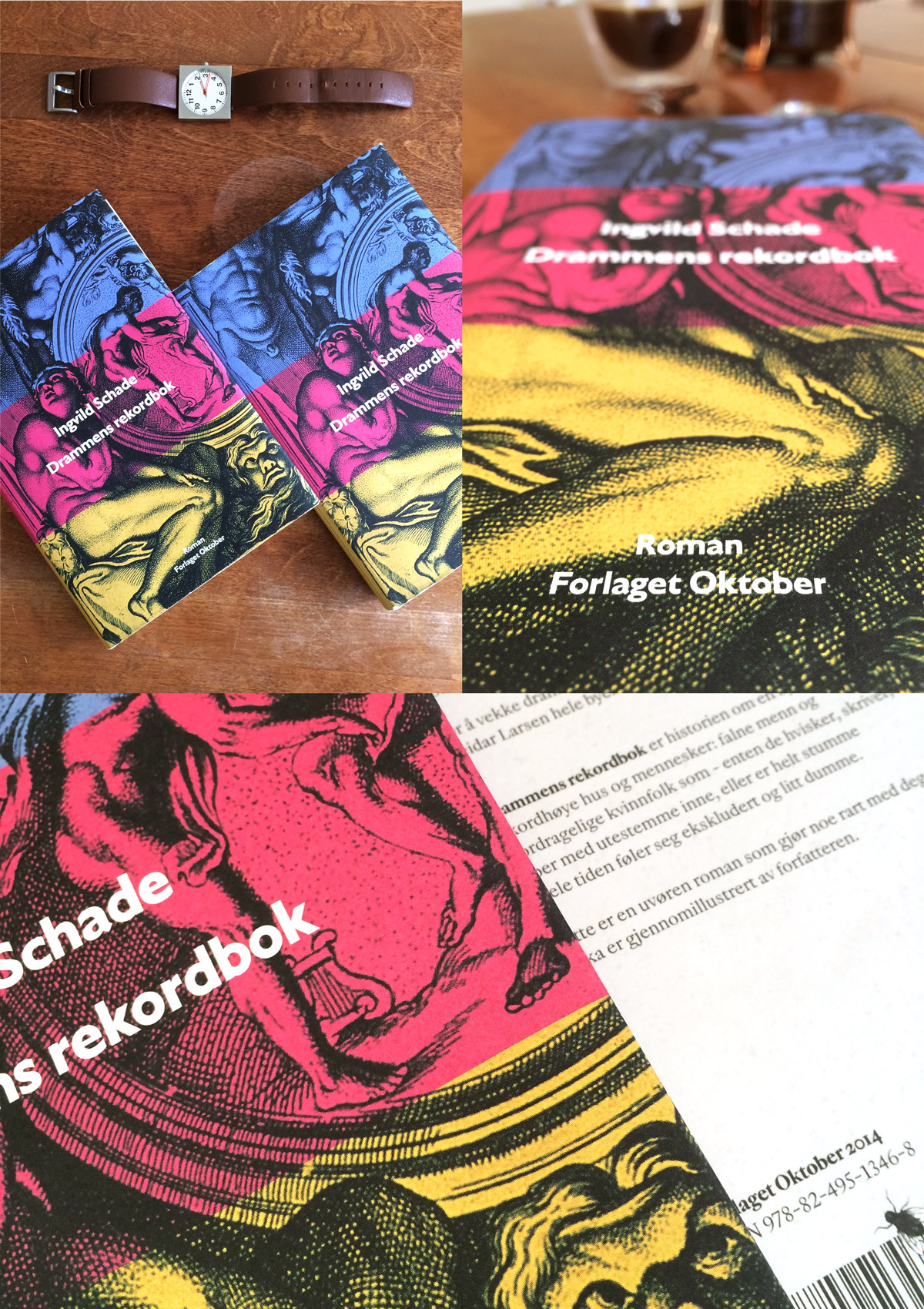
Notes on ‘Drammens rekordbok’
The first thing I ever discussed with Ingvild Schade was her book. We talked about it for a long time, too. It turns out there was a lot to discuss there. It’s a faceted piece of writing: it identifies variously as dark comedy, poetry, bizarre slice-of-life. An interesting novel, to say the least.
A lot of topics raced through my head, but I mostly zeroed in on the pompous nature of keeping records (the title means Record book of Drammen, Drammen being a famously ‘boring’ city in Norway). It’s pretty grotesque to take note of your ‘personal best’, particularly to make it public. It brought me on the path of Greek frieze design and the notion of carving your successes into marble.
Famously, those ancient marbles were once brightly coloured monuments. Erosion (and human intervention) have turned the statues white, but they were always intended to be cheery totems of celebration. I wanted to bring that back in a bombastic, corny, rude way.

I tried a few terrible terrible things before I came to the marbles. From that point on, it was a simple plan: find a classic representation of pride, naïvely paint over it, and put the name of the novel on top.
The dust jacket and hardcover are proudly typeset in my own typefaces, and the book has received great reviews from the Norwegian press. I’m also very proud to be a part of that.
-
A playground
Some things I make are not really a project, not really a sketch, not really a concept, and not really a product. Sometimes it’s just good fun.
I learned a lot from tracing pieces of lettering over the years, and that’s what you’ll see in Play – traced film titles and pieces of lettering from a variety of sources. It’s an itch I like to scratch.
-
Here we are
It hit me very late in the process of making this site that I actually have some work to show to the world. So, a warm farewell to the old single-pager. Please welcome my new website.
Not only is it finally a clear overview of what I’ve made over the years, but it is also typeset entirely in my own work, which is equal parts neat and nerve-wracking. The type family, a collection of styles based on a sort of type-historic ‘what if’, is not yet complete, but what you’re seeing are a few of the most useful styles. I’ll write more about them when I have the opportunity.
Another important note to make is that the face logo, the little mustachioed guy with circular glasses, was drawn by my friend Sam, and it’s my favourite thing in the whole world.
This blog will probably not be as regularly updated as I’d like, but subscribe to the feed to never miss anything. I’ll also remark about it on my Twitter account.
-
Shhhhh…
Please try to be quiet. The site is still waking up. I’ll be adding some things that really need adding, so until I call it, it’s our little secret, okay?