Dokk
Dokk is a newly-published magazine for Norwegian documentary journalism. I designed the whole thing and then built it with my colleagues at Output.
Over the course of two months, I conceptualised, sketched, then designed and implemented an initial brand, basic design guidelines, and functional online magazine. The front page is laid out with simple WYSIWYG tools – drag and drop positioning and inline editing of the title and summary carry 90% of the page.
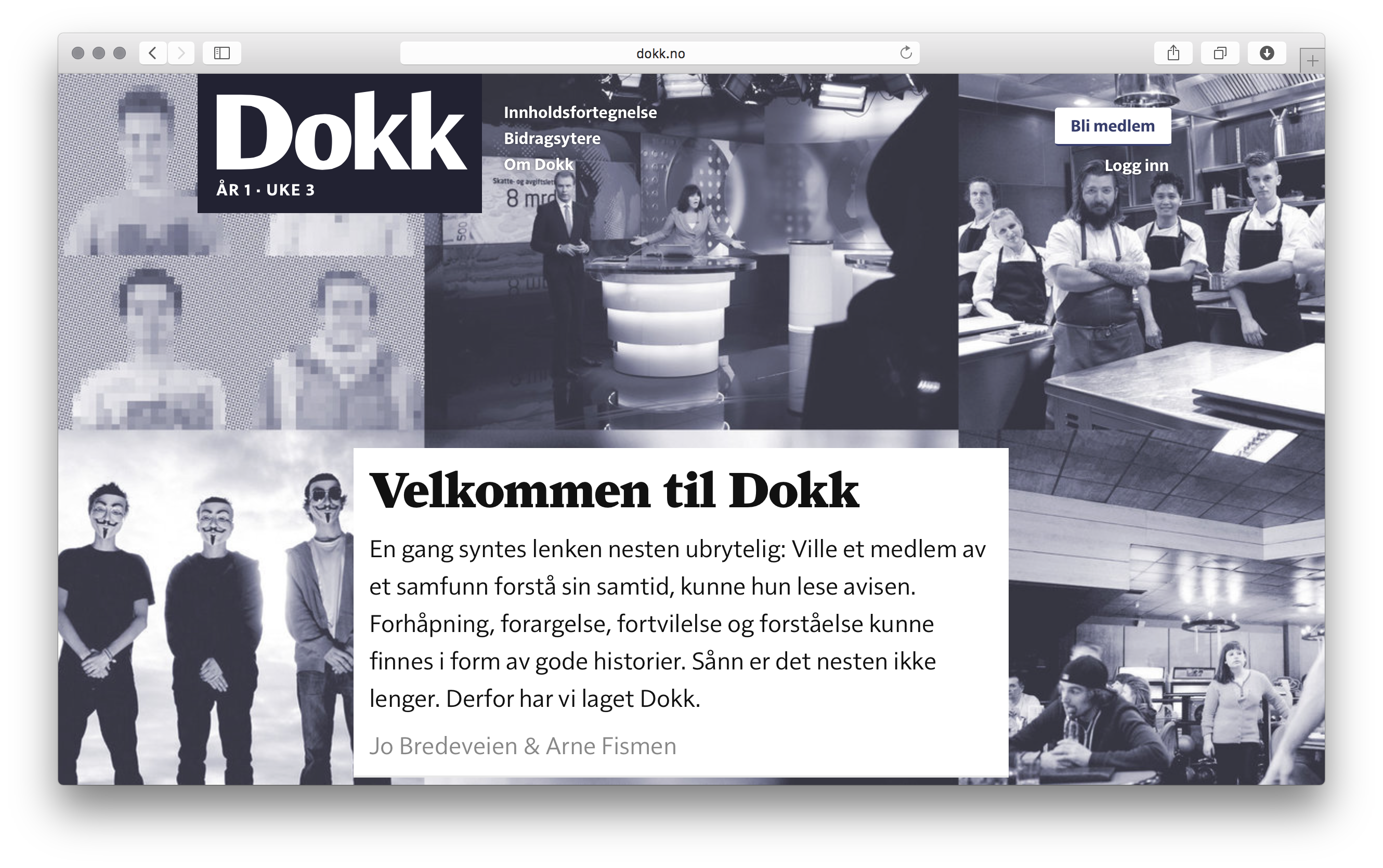
The Dokk front page.
I chose Farnham and MVB Solitaire, two gorgeous typefaces, to set the magazine in, and then drew a logotype as a sort of hybrid of the two. Farnham is used to set the titles and body copy, and it performs fantastically. Solitaire handles the UI parts and the additional levels of hierarchy. The occasional marbles are a way of framing the page when imagery is too much or doesn’t suit the article.
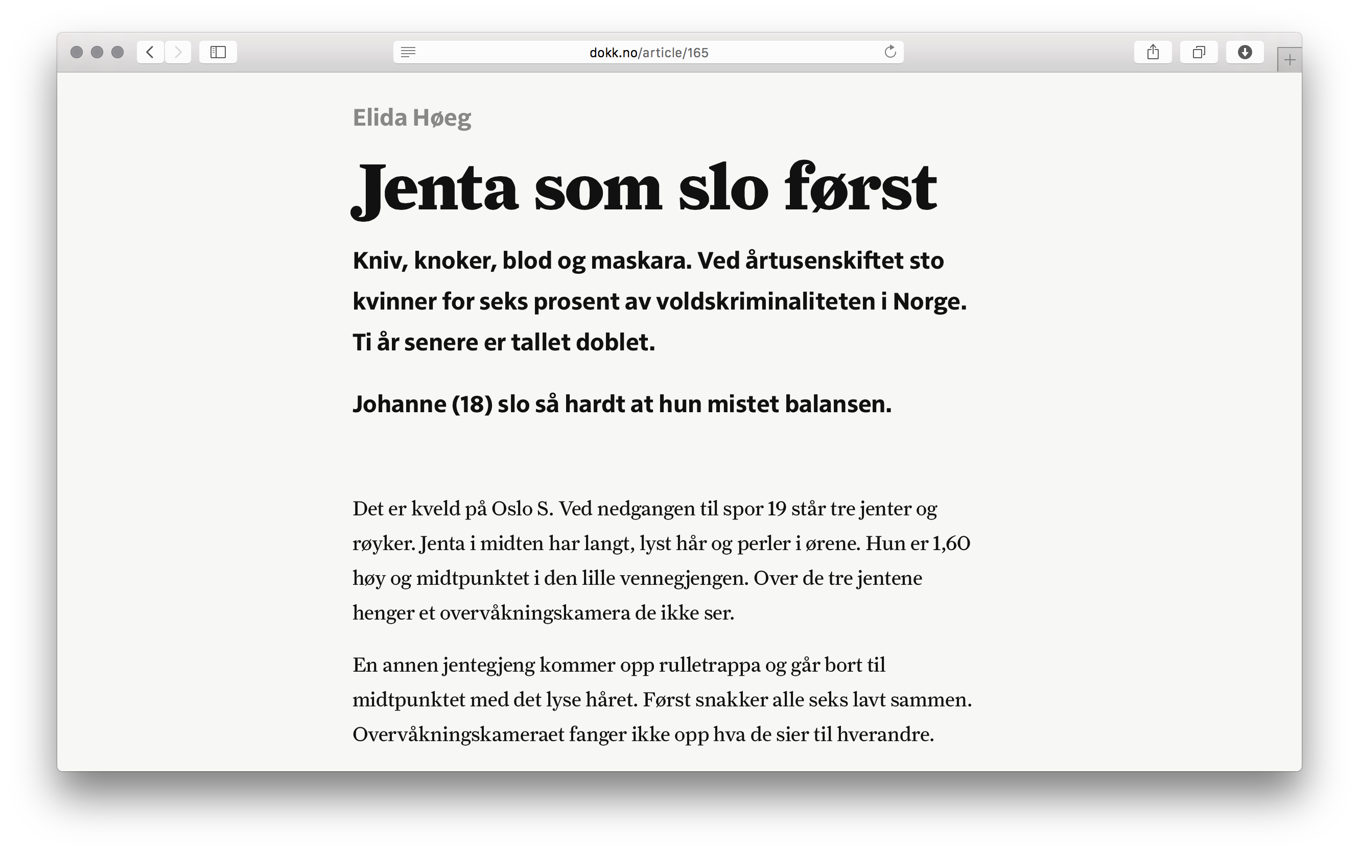
Articles on Dokk.
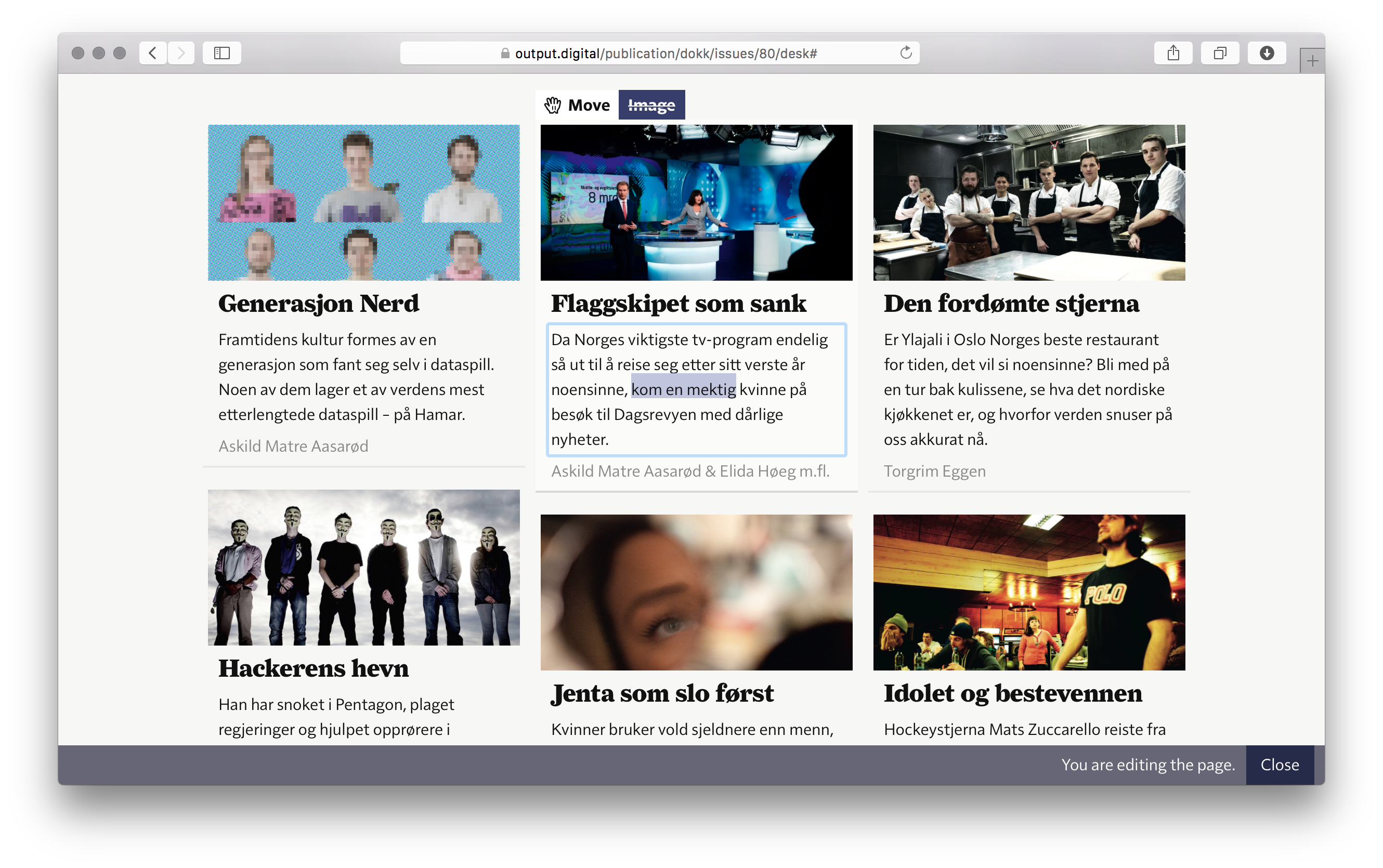
The front page is prepared for publication with a simple what-you-see-is-what-you-get interface.